 Unfortunately, this blog won’t be about how to get your hair cut during this COVID-19 pandemic, but it will be about one of my pet peeves, THINGS NOT LINING UP! Or you can say I have OCD. Whateva!
As I have been working a lot with Blazor recently, one of things I found annoying was how validation was styled in the default Blazor Server template. Here I show you how I fixed it.
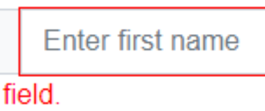
First let me show you what I’m talking about. You can read more about forms and validation here. Here is the de facto look when validation is triggered.

You may not be able to tell from the picture above, but if I magnify it a bit, you’ll notice that the red lines do not evenly match the input control, and the corners are off as well.

The fix for this misalignment is simple, and I will show you the solution so that you don’t have to spend hours like I did researching bug reports and pondering workarounds. I linked to the bug report because at one point, I was trying to develop a way to supplant the Blazor validation classes with Bootstrap’s is-valid and is-invalid classes as a solution, but as you will see, you don’t need to do anything that drastic.
In your project’s /wwwroot/css/site.css file, you will find 2 css classes:
.valid.modified:not([type=checkbox]) {
    outline: 1px solid #26b050;
}
.invalid {
    outline: 1px solid red;
}
It’s these 2 classes that control the validation style. All you need to do is change the markup to use rounded borders instead of outline.
.valid.modified:not([type=checkbox]) {
    border: 1px solid #26b050;
    border-radius: 3px;
}
.invalid {
    border: 1px solid red;
    border-radius: 3px;
}
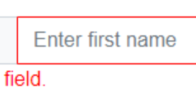
And this is the result when validation triggers.

Nice clean matching lines. Hope this helps someone out there save time and stay safe everyone!
Visit Everleap to learn more about our .NET Core cloud hosting solutions.
No responses yet